 Skip to content
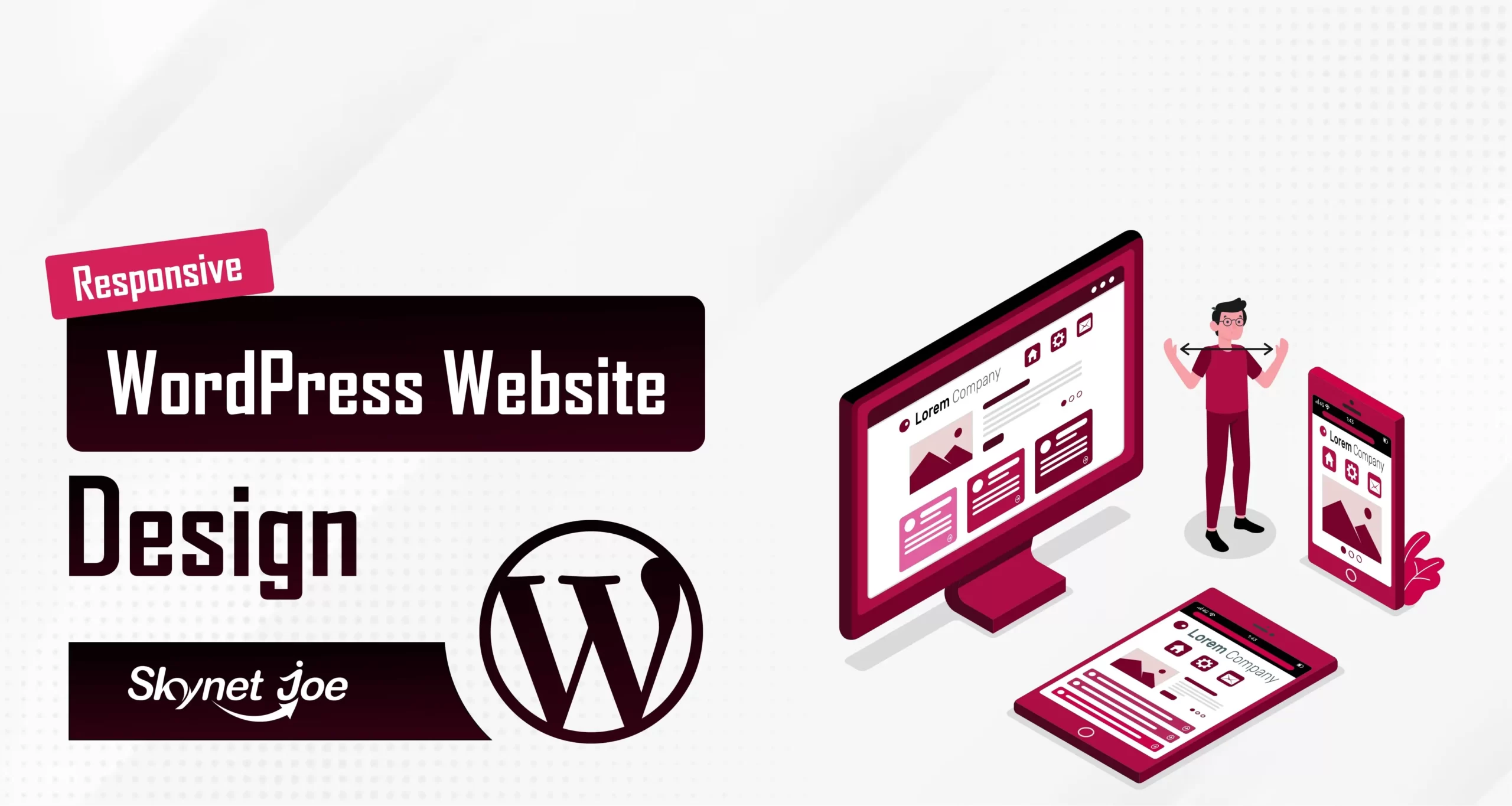
Responsive WordPress Website Design (Create, Convert, Succeed) is your roadmap to achieving online excellence. In this comprehensive guide, we dive deep into the world of responsive design, offering you actionable insights that will empower you to create visually stunning and highly adaptable websites. Discover how to captivate your audience by providing an exceptional user experience across all devices. Learn the art of seamless design conversion, ensuring that your visitors not only stay but also take the desired actions. Whether you’re a seasoned web developer or a business owner looking to enhance your online presence, this article is your key to success. Join us on this journey as we unravel the secrets of responsive design, providing you with the tools and knowledge needed to thrive in the digital landscape. Don’t miss out on the opportunity to transform your website into a powerful asset that converts visitors into loyal customers. Dive in now and unlock the full potential of responsive website design.
In today’s digital landscape, where smartphones, tablets, laptops, and various screen sizes dominate, ensuring a consistent and captivating user experience across all devices is paramount for every website owner. This is where the power of responsive WordPress website design, enables websites to effortlessly adapt to every screen size. In this article, we’ll explore the art of mastering responsive design in WordPress, uncovering key techniques and best practices to craft seamless cross-device experiences.
Understanding Responsive WordPress Website Design
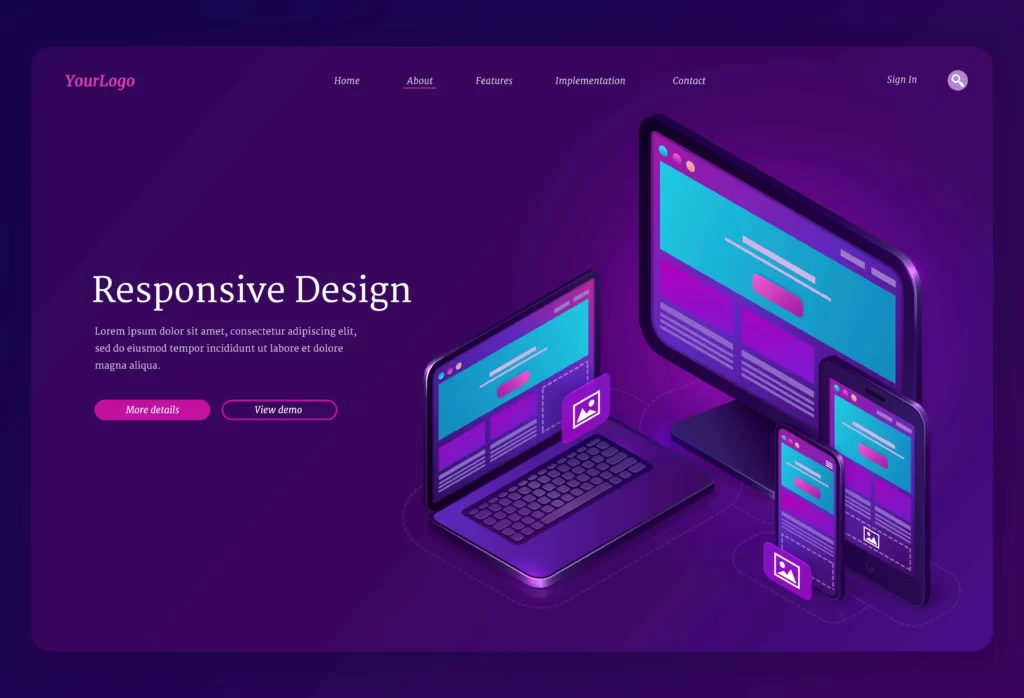
Responsive design is a web design approach that prioritizes the creation of websites that automatically adjust their layout, content, and elements to suit different screen sizes and orientations. Instead of developing separate websites for each device, the responsive design employs flexible grids, fluid images, and media queries to guarantee that the website looks and functions optimally on everything across a spectrum of devices, spanning from compact smartphones to expansive desktop monitors.
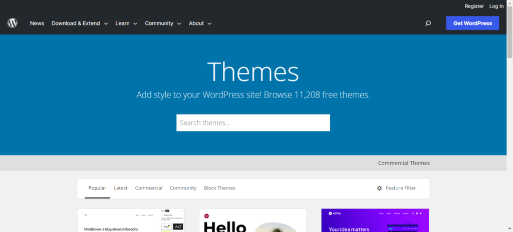
Choosing a Responsive Theme ( Responsive WordPress website design)
The journey to responsive design begins with selecting a suitable WordPress theme. WordPress offers a wide array of themes optimized for responsiveness, meaning they are equipped with the necessary CSS and HTML structure to adapt gracefully to various devices. It’s crucial to ensure that the theme not only looks impressive on your desktop but also performs seamlessly on smaller screens.
Choosing the right foundation for your website’s design is pivotal, and this is where a responsive WordPress theme truly excels. A responsive theme serves as the canvas upon which your website’s visual identity and functionality are expertly displayed.
Imagine a theme that effortlessly adjusts to the screen size of every device, from the compact display of a smartphone to the expansive expanse of a desktop monitor. With a responsive theme, this vision becomes a reality, as it’s constructed with the inherent capability to seamlessly transform its layout and design elements, ensuring a consistent and captivating user experience across the entire spectrum of devices.
The worries about how your website will appear on different screens are a thing of the past. A responsive theme empowers you with the confidence that your content will be presented flawlessly, optimizing text readability, image proportions, and interactive features for every user, whether they’re swiping on a touchscreen or navigating with a mouse.
But it’s not just about appearances. A well-chosen responsive theme enhances your website’s performance by prioritizing speed and efficiency. Through carefully crafted CSS and HTML structures, these themes guarantee that your website loads swiftly on mobile networks and high-speed connections alike.

Flexible Grids and Layouts
Flexible grids form the backbone of responsive design. CSS frameworks like Bootstrap or Flexbox can be immensely helpful in creating fluid and adaptable grid systems. In WordPress, these frameworks can be seamlessly integrated into your theme’s design, allowing you to define how elements reflow and rearrange themselves as the screen size changes.
Fluid Images and Media
Images and media can significantly impact the load times and overall user experience on mobile devices. To ensure your WordPress website remains responsive, use CSS to ensure images scale appropriately based on the screen width. Additionally, consider implementing HTML5 and CSS3 techniques like the “max-width” property to prevent images from exceeding their original dimensions.

Media Queries for Custom Styling
Critical to responsive design, media queries play an indispensable role. They allow you to apply specific CSS rules based on different screen sizes. By strategically crafting media queries, you can rearrange content, adjust font sizes, and hide or display certain elements to optimize the user experience on various devices.
Mobile-First Design Strategy
Designing for mobile-first is an effective approach in responsive design. Start by creating the mobile version of your website first, focusing on the most critical content and functionality. This forces you to prioritize what’s truly essential for users and then progressively enhance the design as you move to larger screens.

Testing and Iteration
Responsive WordPress website design is an ongoing process that requires continuous testing and refinement. Utilize tools like Google’s Mobile-Friendly Test and browser developer tools to simulate various devices and screen sizes. Regularly check your website’s performance and layout on real devices to identify any issues that might have been missed during development.
Plugins for Enhanced Responsiveness
WordPress offers an array of plugins designed to enhance responsiveness. Plugins like “WPtouch Mobile Plugin” and “WP Super Minify” can help optimize your website’s performance on mobile devices by minimizing resources and adapting content for touch interactions.
Conclusion
Mastering responsive WordPress website design is all about creating harmonious user experiences across devices, ensuring that your website remains accessible and engaging to visitors, regardless of how they access it. By selecting a responsive theme, employing flexible grids, fluid images, media queries, and a mobile-first strategy, you can create a seamless and consistent online presence that caters to the diverse landscape of modern digital devices. Remember, the journey doesn’t end once your responsive website is live; continuous testing and improvement are key to delivering an exceptional cross-device experience.
Ready to take your website to the next level? Trust the experts at Skynet Joe, your leading WordPress development partner with over 3+ years of unmatched work experience and a track record of delivering 100% customer satisfaction. Our expertise spans all niches of business, ensuring that your website not only meets but exceeds your expectations. Join hands with us to transform your online presence into a powerful asset that drives results. Let’s collaborate for web excellence; contact Skynet Joe today.


3 thoughts on “Responsive WordPress Website Design (Create, Convert, Succeed)”
Pingback: Jewelry Website Design Company | Dazzle and Succeed
Pingback: ClickFunnels vs WordPress: Unveiling the Choice
Pingback: Affordable Web Design | Building Your Online Presence Within Budget
Comments are closed.